Craft
The Waterfall Countertop Is Quietly Going Out of Style
The waterfall countertop became the reflex flourish of every luxury kitchen. The designers shaping the next decade have already quietly moved on — here is why.
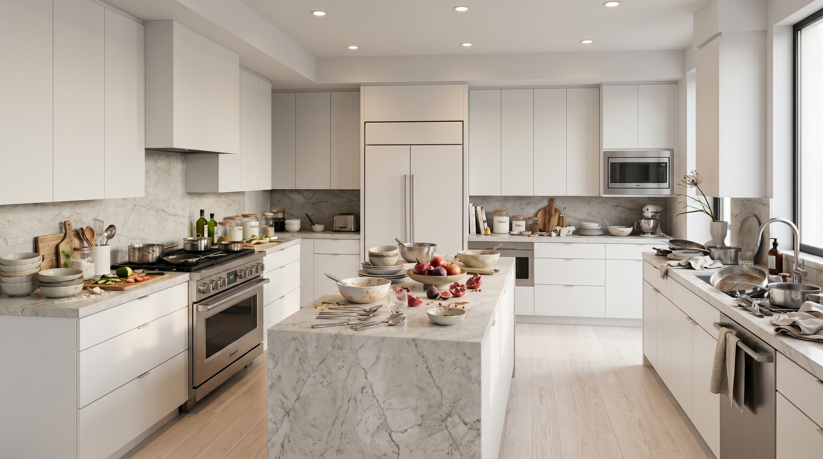
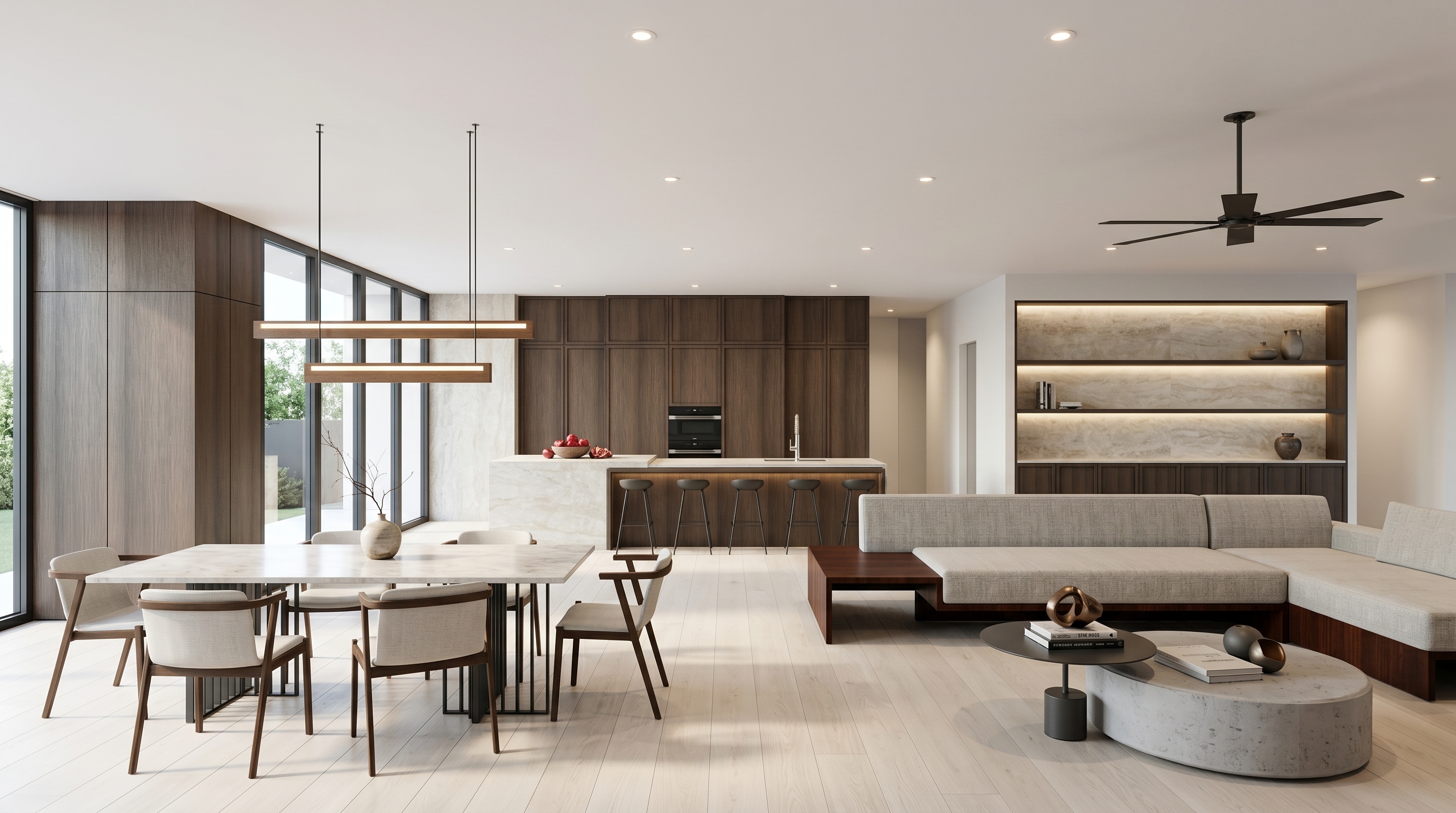
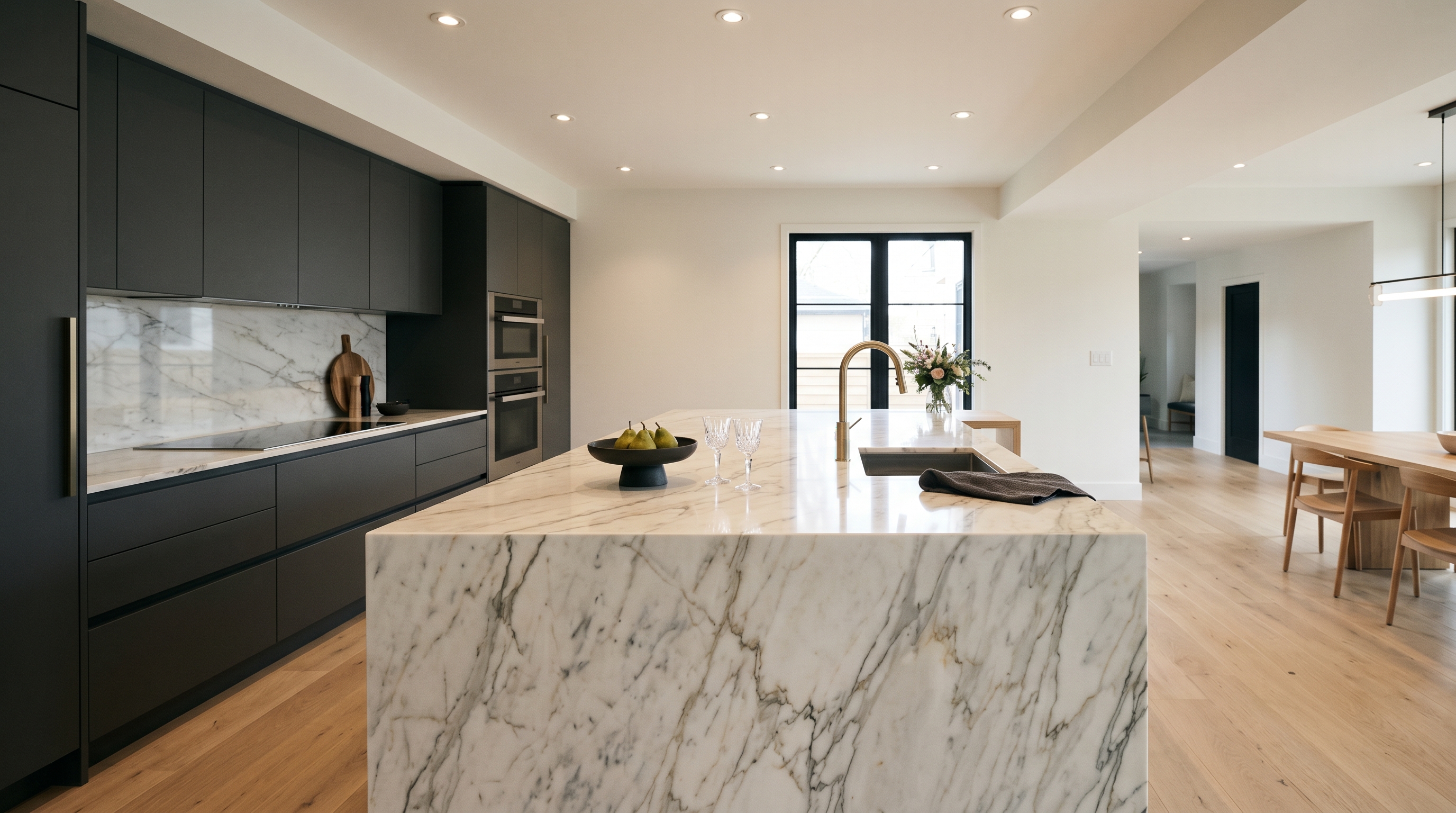
The waterfall countertop has become the easiest way to signal a serious kitchen. A slab of stone runs the length of the island, folds down at a clean ninety degrees, and drops to the floor on both ends. It reads as architectural. It photographs well. It has been the default flourish of the luxury island for the better part of a decade.
It has also already started to leave the room.
The designers shaping the next decade of kitchens have quietly stopped specifying it — not because it is ugly, but because it stopped earning what it costs. The waterfall edge is now the kitchen's equivalent of three matching pendants in a row: a thing you do because it is expected, not because the room asked for it.
The trend the designers have already left
The numbers say it cleanly. In Apartment Therapy's fifth annual State of Home Design survey, published in January 2026, thirty-six percent of designers named the waterfall edge as the countertop trend most ready to be retired. It was the most-cited "out" feature in the survey. The reason offered was not aesthetic exhaustion — it was the loss of meaning. When every flip and every spec apartment has one, the gesture stops gesturing.
The editorial press has been moving the same way for over a year. Livingetc's design team — its editor and deputy print editor among them — has said openly that they are over the look, citing "blocky" proportions and a slip from deliberate move to reflex. The architect Danny Dobson put it most plainly: it was a trend, and splitting the work surface from the floor adds more dimension. He is not wrong.
The waterfall edge was once a way to break a rule. It has become a way to follow one.
What the waterfall is actually doing to the room
Strip the aesthetics away and look at what a waterfall does to an island. It takes the two ends of the most-used object in the kitchen — the points where a cook stands, where a stool tucks in, where a hand reaches for storage — and seals them behind two flat planes of stone. The cost is paid in the things you do not get to put there.
There is no end-of-island drawer for the things you want closest to the seat. No open shelving at the short end for a stack of trays or a cookbook. No corner where a stool can be drawn in clean against a kicked-in base. The island reads as one continuous block, which is why the architect Georgina Wilson has called the move the design equivalent of placing three pendants in a row — something done out of habit rather than creativity.
That trade is fine if the silhouette truly is the point. In most kitchens, it is not. The island is the busiest object in the room, and the waterfall asks it to behave like a sculpture instead.
The maths is no kinder than the aesthetics
A waterfall is not merely two extra panels of stone. It is two perfectly mitered seams cut to the exact thickness of the slab, executed on stone that has to remain unblemished across the full length and the full drop. The yield rate on the material drops. The fabrication cost climbs. And the structural detail — a vertical run of heavy stone meeting the floor at a hard seam that catches every crumb wiped off the counter above — is one of the most fragile details in the kitchen. Chip a mitered edge and the repair is rarely invisible.
So you are paying more for material, more for fabrication, more for protection — and paying it for a detail the trade press now reads as dated. That is hard maths to argue with even on the day the kitchen is photographed.
What to do with the island instead
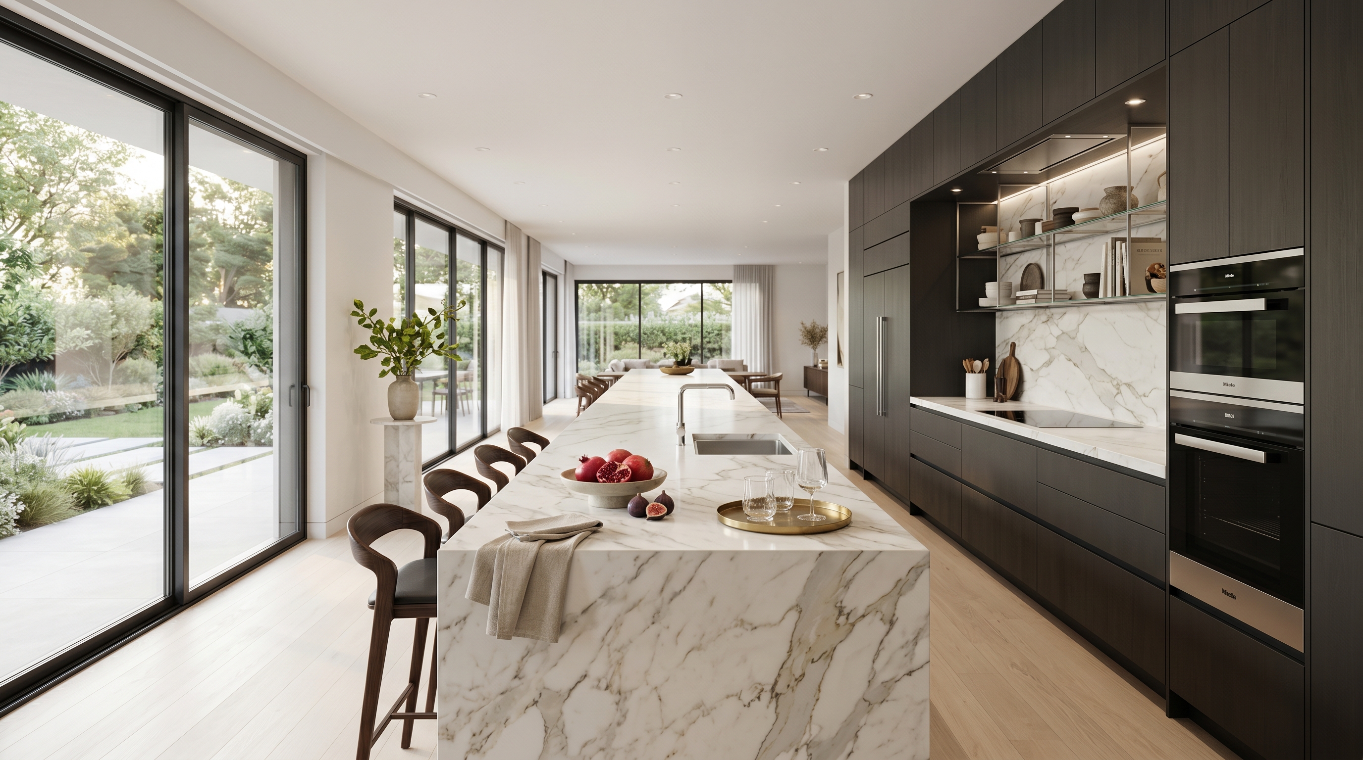
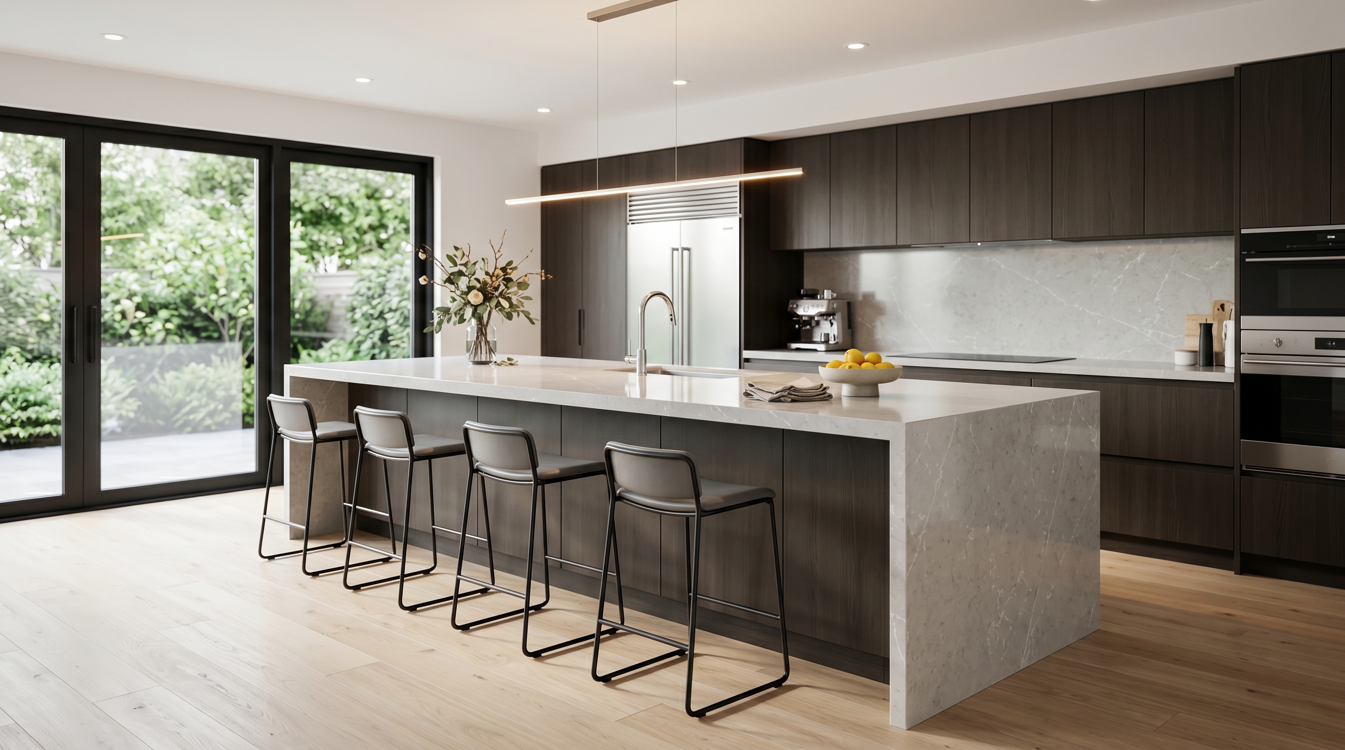
The better instinct is to let the end of the island work. Cap it with a substantial countertop overhang — far enough for a stool to tuck cleanly under, finished on its underside as if you meant it — and treat the short end as an opportunity, not a closed face. A single deep drawer that reads as a column, a slot for trays organised vertically, a run of open shelving: any of these earns more daily use than a sealed plane of stone ever does.
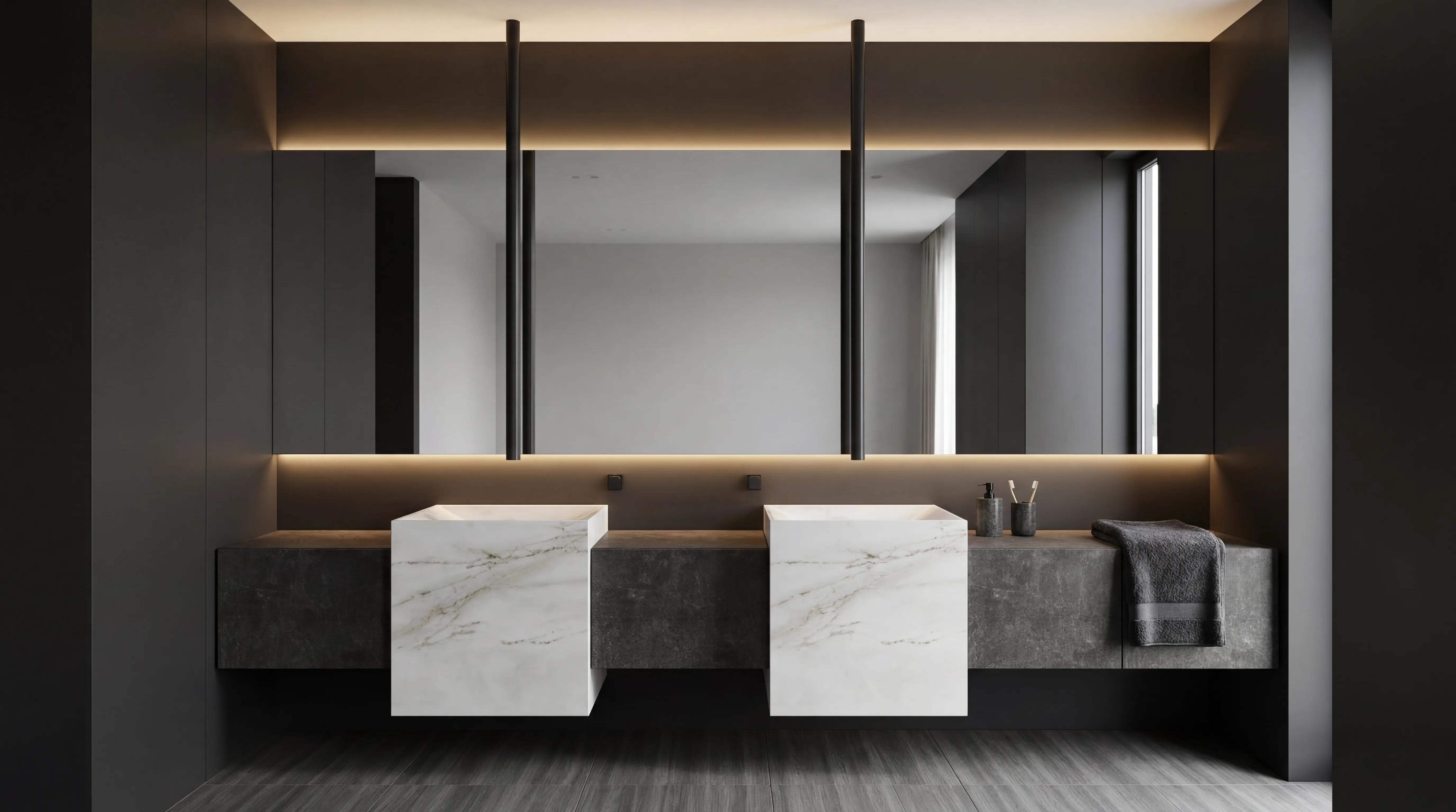
If the stone really is the story, lift it instead of dropping it. The 2026 trade is specifying stone "drenching" — the same slab carried up the backsplash and onto a shelf above — far more often than the waterfall. It puts the material at eye level, where it is seen, rather than at floor level, where it is bumped. The effect is more architectural, costs less stone, and ages better.
Then think harder about the silhouette of the island itself. Curved ends, pill-shaped plans, rounded corners — the shapes designers are reaching for now do not lend themselves to a waterfall at all. The geometry that flatters a working kitchen is rarely the geometry that flatters a flat plane of marble. We have made the case for sizing the island honestly in why most kitchen islands are too big; the waterfall is the easiest place to start cutting.
The composure was never in the slab
A kitchen ages well when its decisions are felt rather than seen. The waterfall countertop was the opposite — a decision designed to be noticed first and used second. The most considered kitchens being built right now still use stone with conviction, but they let it work for the cook and the room before it works for the camera. That is the version that still looks composed in year fifteen.
Book a private showroom tour
If this changed how you are thinking about your kitchen island, the next step is not another article. Book a private showroom tour and spend an unhurried hour with a BauTeam design consultant — at the studio nearest you in Atlanta, Boston, Burbank, Chicago, Dallas, Las Vegas, Los Angeles or New York. Bring your floor plan. We will help you design the island that earns its place.